In which a group of graying eternal amateurs discuss their passions, interests and obsessions, among them: movies, art, politics, evolutionary biology, taxes, writing, computers, these kids these days, and lousy educations.
E-Mail Donald
Demographer, recovering sociologist, and arts buff
E-Mail Fenster
College administrator and arts buff
E-Mail Francis
Architectural historian and arts buff
E-Mail Friedrich
Entrepreneur and arts buff
E-Mail Michael
Media flunky and arts buff
We assume it's OK to quote emailers by name.
|
 Old de Young building.
 Aerial view of museum under construction.
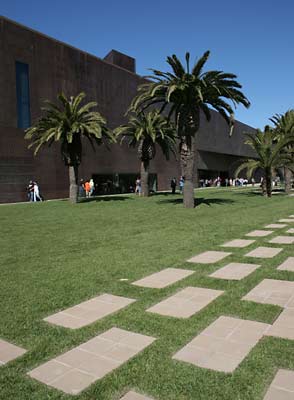 Approach view.
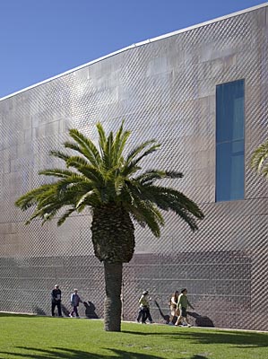 Exterior copper wall, texture.
 Goldsworthy entrance courtyard art.
 Museum tower.
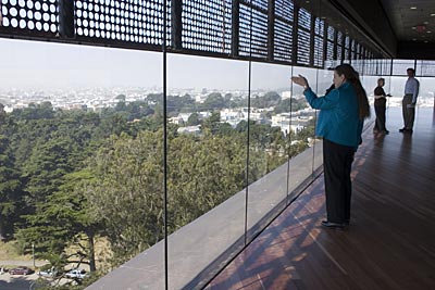 Observation floor.
 Bench made from Eucalyptus.
 Main stairway area.